Designing a convincing executive presentation on the value of IT
The Information Technology division (IT) is an integral part of any business today. Yet, it often gets the blame for high Total Cost of Ownership (TCO), redundant and legacy applications, and high IT headcount.
Businesses aiming to improve their bottom line often look at IT as a good candidate for savings. When there is a project aiming to cut IT costs, it is hard to easily justify IT value to the business without showing certain links between the key business functions and IT services that enable them.
My recent experience in this area shows that it is possible effectively illustrate these important links.
I previously wrote about executive presentations which explain a project roadmap. The key idea I suggested was limiting the presentation to a single slide, because executives rarely have the time to go into a lot of detail. Instead, the presentation should provide an overview of the key points at a glance.
When you only have one slide to work with, it forces you to focus on presenting only the essential information. However, you can still go into detail during the presentation if discussion starts about any particular aspects. Think of your slide as a summary and a focal point for further discussion.
So let’s look at how a one page poster may give executives insight into IT - the opaque part of the business.
What to include?
To make the picture clear, we need to show business functions (unique and shared across the business), business units performing these business functions, enabling IT services (covering applications, technology components and IT infrastructure), indicate profit/cost centres, and finally, add some figures:
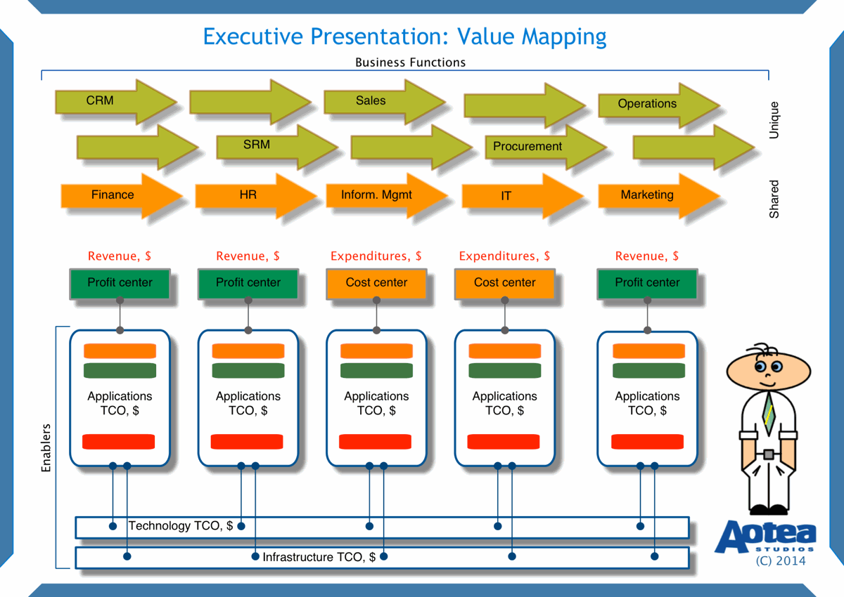
There are two ways to start your picture. You can start from the bottom, i.e. depicting enabling IT services based on combinations of applications, technology components (databases, middleware, operating systems etc) and infrastructure (servers, network devices etc.) and work your way towards business functions at the top.
You can also start from the top, i.e. start presenting business functions and then work your way down to the IT infrastructure.
Regardless of the way you chose, key elements that should be presented in your picture are:
- Business functions (unique and shared across all business divisions)
- Profit and cost centres
- Applications (use business names)
- Technology block (with key components in it)
- Infrastructure block (with key components in it).
TIP: Technology and infrastructure components can be significantly larger and more complex than the applications which rely on them. However, your audience is not very familiar with these deep details (and not even interested in them, for the most part), so my suggestion would be to just highlight the most critical ones that attract high costs (licenses and maintenance fees).
How to illustrate complexity?
As accounting people say, apples should be compared with apples. In our case, all elements should have dollar values allocated to them. It is better to use annual figures. Make sure that you use the same unit of measure (thousand, million, billion) in all of the presented figures.
Let’s firstly add figures to the profit centres (earned revenues) and then to IT enablers (applications, technology and infrastructure) of business functions.
We can also show amounts allocated to cost centres to keep the picture consistent. Work with finance stakeholders to learn how costs are allocated to cost centres in a company you are working for.
Now it is a good time to allocate annual figures to IT services. Allocate appropriate TCO amounts to the applications, technology components and infrastructure.
Now we’ve reached our goal: we can compare earned revenues across the company (value to the business from its functions) versus investments made into IT services enabling the business functions. Using the given numbers, you, for example, can take a ratio between the two and then compare the result with available benchmarks in the industry the business belongs to. Or, you can take a ratio of IT investments to earned revenues to show a share of IT investments in the earned revenues.
What are the benefits for executives?
Firstly, the executives are able to deal with a much less complex context which allows them to discuss numbers rather than complexities of the IT world.
Secondly, the decision making is supported by a transparent picture expressed in a business language that is understood by the both sides.
Finally, it is easy to show IT “heavyweights” and “lightweights” in the business environment. Highlight specifics with colours to help you get buy-in faster.
What are the benefits for BAs and PMs?
BAs and PMs can enjoy clear and effective communication of the results of their efforts in the initial phase of a project.
The mapped applications can be additionally coloured at later stages to distinguish between say on-premise, bespoke, commercial off-the-shelf (COTS), software-as-a-service (SaaS) or any other way as you may see them. Be creative in terms of using colours - they enrich the picture and help to memorise the key message.
Grouping these applications can help you to handle discussions about project objectives (clarify), project scope (refine) and expected project timeline (time/budget/resources). Any concerns can be discussed using the same elements and terminology, thus facilitating buy-in of the executives.
Summary
In this short article I illustrated a simple and effective way to illustrate complex links between business functions and their outputs (earned revenues), and investments into the IT services enabling the business functions. Practise the technique in your projects and extend it as it suits you.
Good luck in your projects!

New! We have published a new book: A Navigator to Business Analysis.
Over 400 pages of practical, useful material will help you build your skills and advance your career! Find out more and get free excerpt.
Free course: BABOK 3 Navigation Maps
Subscribe and get an overview of the knowledge areas in BABOK 3. (Very occasionally, we may let you know about discounts and specials).